kate
Objective
The project focused on the rebranding of kate, a growing social media presence in the food and travel industry. The goal was to strengthen its digital footprint and create a cohesive, modern visual identity that would resonate across multiple platforms while remaining adaptable. The primary objective was to develop a fresh and timeless brand that would appeal to a broad audience while supporting the company’s ongoing growth.
The rebranding aimed to convey the spirit of culinary exploration and travel in a way that was engaging without overwhelming the audience. A minimalist design approach was adopted to balance simplicity with depth, ensuring the brand message remained clear and approachable.
Framework
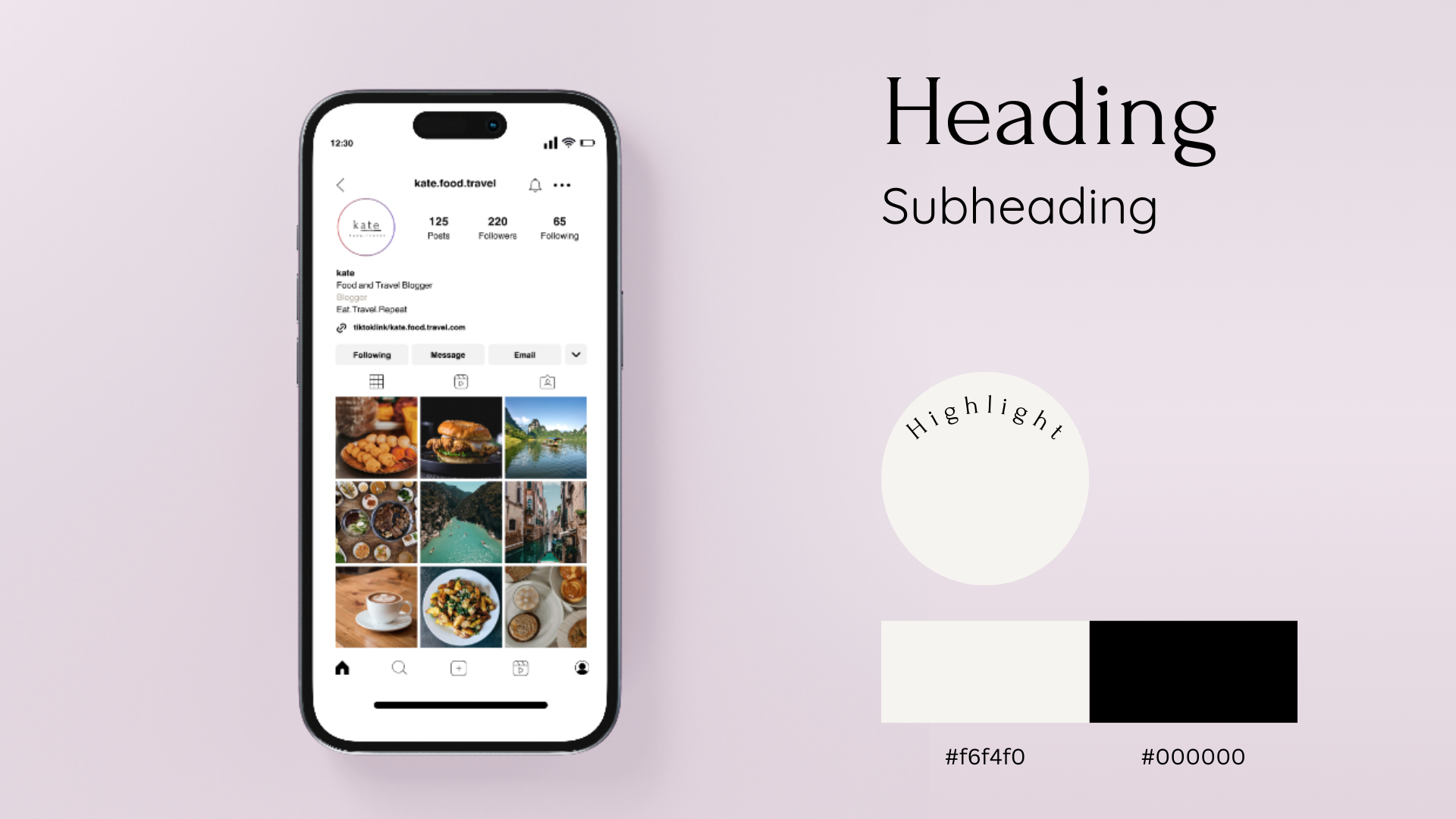
The project was built on minimalist design principles, beginning with the careful selection of typography that reflected both food and travel in a clean, modern manner. The chosen typeface was selected for its clarity and elegance, helping to establish a sophisticated yet accessible brand personality.
A comprehensive visual design system was then developed, incorporating a soft, natural color palette and modern typography to reinforce the brand’s overall identity.
This design system was crafted to ensure consistency and flexibility across TikTok and Instagram. By focusing on simplicity and elegance, the rebrand successfully captured the essence of kate, helping to enhance its online presence and connect with a wider audience.
Role
Concept Development
Visual Design
Brand Typography
Brand Design
Rebranding
Client
kate